The Animation Jam is the second assignment I have to complete for my Timing For Animation module. It consists of me creating a short animation between 10 - 30 seconds in which I will attempt to showcase the skills and techniques I have learned throughout the semester.
Each Student on the course is taking part in the Animation Jam, and at the end all the animations will be connected to create one long "Animation Jam". This years theme is the very hot topic of the Multiverse. I think that this theme is great as it gives me a lot of flexibility in what I can create and should allow me to make something very fun. I look forward to getting stuck into my animation.
Early Concept Description
To start off getting an idea for my animation, I discussed with a few friends about what we thought a multiverse animation could look like. The general consensus was that most people will probably use a portal of some kind or do different versions of reality, as this is commonly used as the multiverse. However I knew that I wanted to do something a bit different, something more out there.
So we came up with this idea about taking drugs and the "trip" being the multiverse. Basically every time the character trips he is in the multiverse, seeing different things and not really knowing what is going on. It was a very basic idea, but there was a few fundamentals I knew I wanted to include. I wanted my animation to be:
1. Something different
2. Funny
3. Unpredictable
Something Spacey is a animated YouTube video which sort of follows the same plot that I hope my animation will. I plan on using it as a big part of my inspiration throughout and hope I can create an animation which is half as good as this one is.
Character Design
For my animation I knew I needed two characters and no more or else it would become too complicated. I knew that my own drawing abilities aren't the strongest in the world so straight away I opted against using human characters. I decided that using animals would allow me to go down a more cartoony route and should make the drawing overall a lot easier.
A big inspiration for me character wise was Regular Show. Mordecai and Rigby were exactly the kind of characters I wanted to create. Not too complicated to draw, but were still able to convey emotion however they needed.
This video to the right shows the storyboarding process used for the Regular Show pilot. It was sent into our class discord by one of my other class mates and I just found it amazing. The shear amount of post it notes used is absurd and it was a massive inspiration to me throughout the design process for my animation.
Mordecai is a Bird and Rigby is a Racoon, these are two popular animals for animated or live action characters to use and it would of been really easy for me to use the same animals for my animation. However I knew that I didn't want to do this and therefore went online and started looking at exotic animals which maybe wouldn't be everyone's first thought.
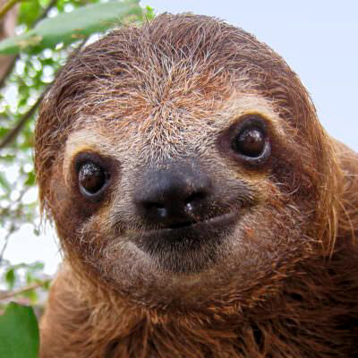
I ended up choosing a sloth as my first character. There was just something about how a sloth looks and acts which drew me in. They move super slowly and just look really goofy. Two things I knew I could try and incorporate into my animation for humorous effect. So I set off trying to create my Sloth man.
I Started off with some very simple sketches of sloth faces. I was doing this while looking at different pictures of real life's sloths and other drawings on the web. I was using these for inspiration and just doing a quick sketch of whatever was in my mind at the time. I was trying to keep it as simple as possible so that drawing wouldn't be too much hassle. My favourite sketch was the closest on the top row. I felt it looked goofy and kind of gave off a "Stoned" vibe.

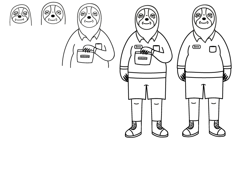
I decided to clean this sketch up and then develop it some more by giving it a body. I based his general body shape and clothes off of Teddy from Bobs Burgers. To draw his body I took a picture of Teddy and drew out his body shape and then connected it to my sloth head. I think this was a great idea as it saved me a lot of time and gave me the body shape I was looking for.
I drew him holding a bag of shrooms as I decided that he would be the one giving out the drugs rather than taking them. Again I found a picture of Teddy from Bobs Burgers holding a bag as reference for my drawing. Using references definitely helped me out a lot and is something I will definitely do in the future.
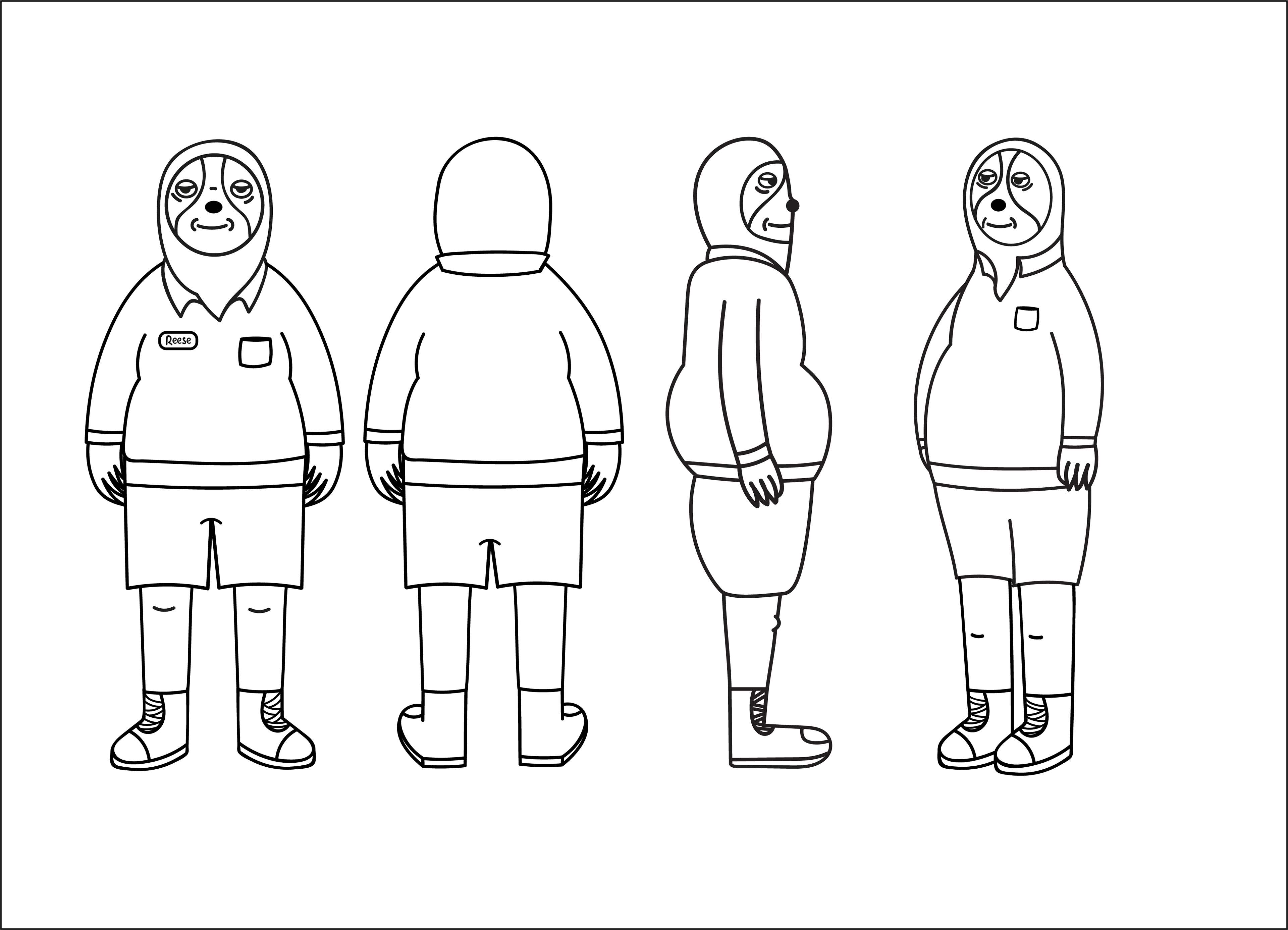
I then went on to create a character turn around for my sloth, who I have now named Reece after one of my friends, not for any particular reason. I actually found the character turnaround really hard. Getting the different angles right and having everything in proportion was tricky, however it was useful in visualising the whole character and how they might move. I think it was a beneficial process and is probably something I would do again when creating a character, even if I know I wont need any of the angles I am drawing, they will be useful to have just in case.
I didn't colour Reece at this stage, which I feel was a mistake. Setting out a clear colour palette for him would of helped me a lot further down the line and also saved me some time. This is something I now know to do in the future.
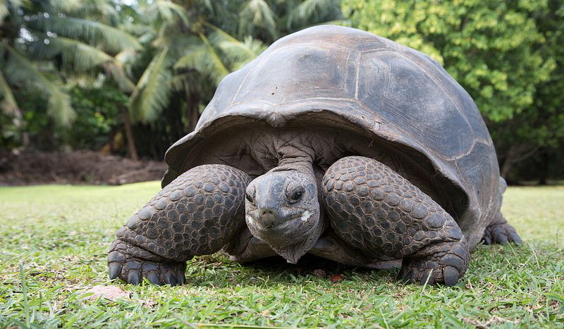
Now that I had finished designing Reece I could move on to my next character. And just like Reece I began by looking for exotic animals. I came across the tortoise, although not exactly that exotic I decided that the shape might work really well for a character and again could lead to funny emotion and body language. So I began creating my tortoise character.

With my tortoise I actually didn't do any sketches bar one, and this is the design i decided to go with. Unfortunately I no longer have the sketch layers as I must have got rid of them somewhere along the way. Anyways, I created a very basic old man looking tortoise. I decided that he would wear a jumper over his shell for ease of drawing and overall I was extremely happy with how he turned out.
I went on to create this character turnaround for him and even decided to colour him in. Like I said earlier, giving him a colour palette now saved me so much time and is something I will definitely be doing from now on.
I decided that my tortoise character would be called Terence and Terry for short. This is an extremely popular named for tortoises and turtles so I figured I would just follow suit.
Storyboard and Animatic
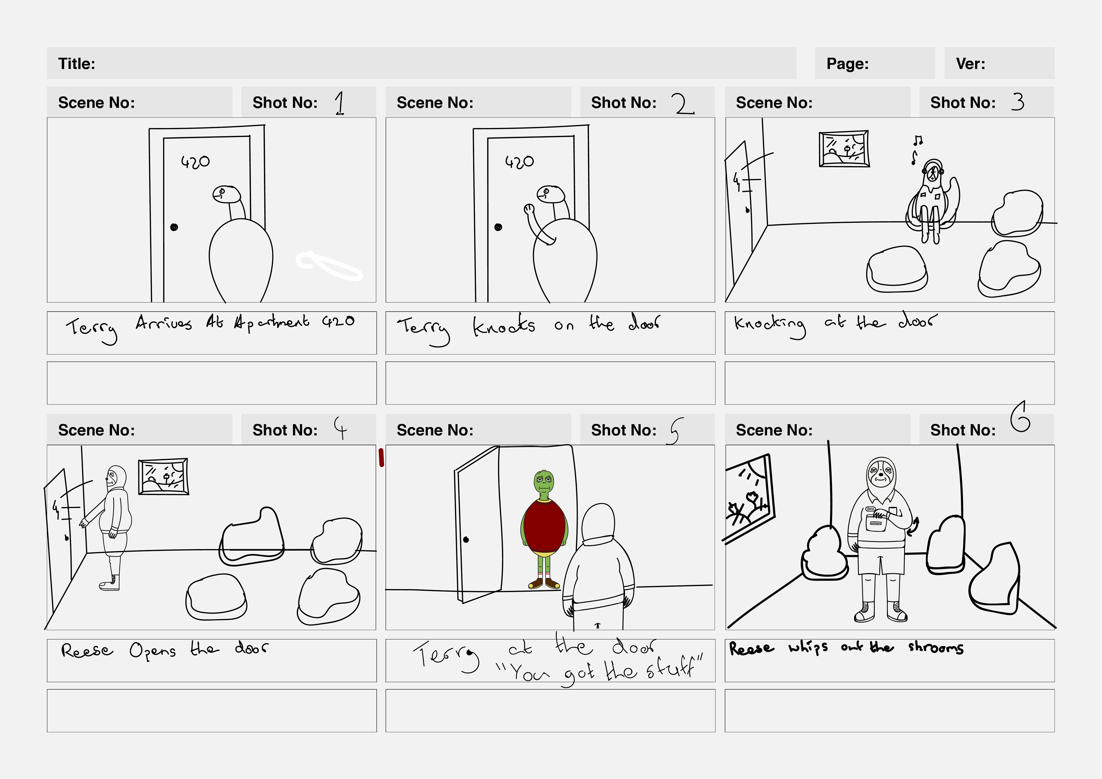
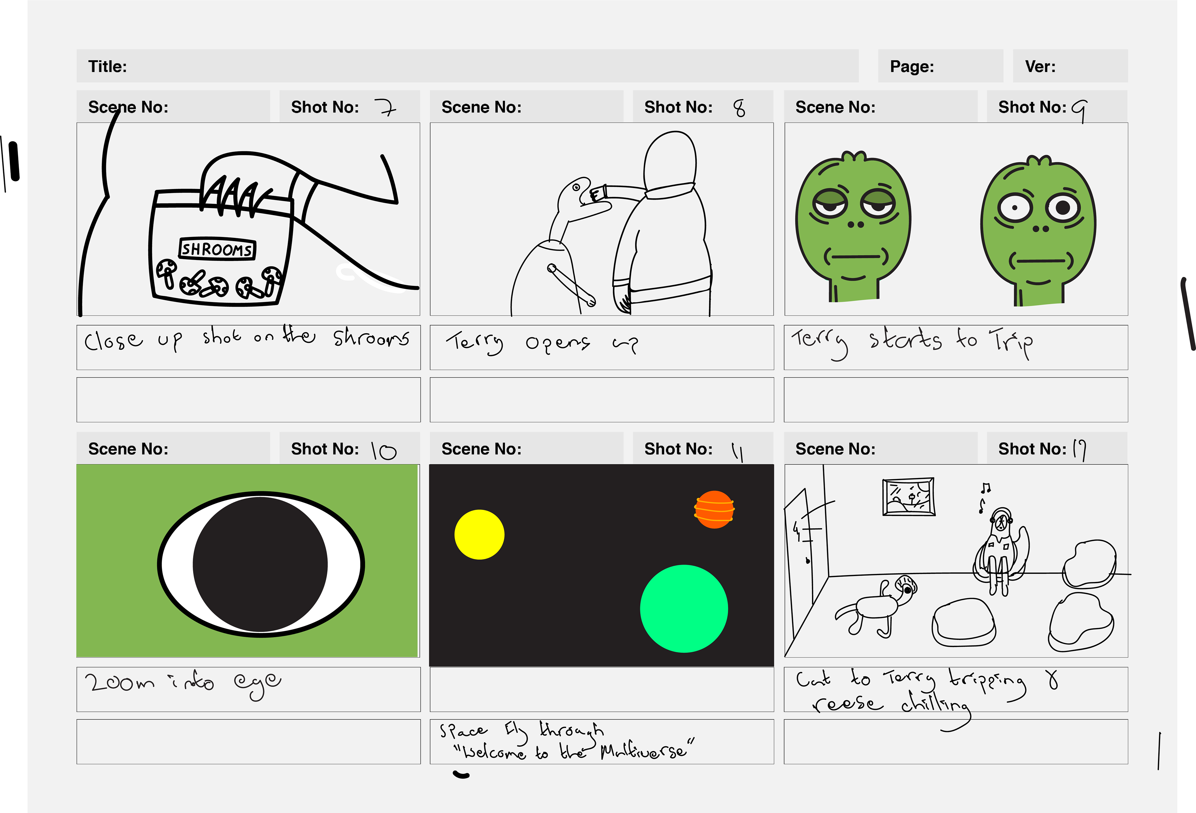
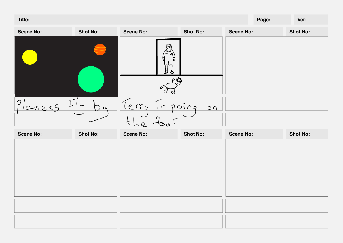
The General gist of my story is that Terry shows up at his friends/dealers house, who is Reece. Reece then gives Terry the shrooms and from here we begin to see Terry change. He starts to trip on the mushrooms and then it zooms into his eye until completely black. From here the planets and space start to fly by, this is the multiverse that Terry is in. The shrooms basically transport him to a different universe but his original body is still in this universe, tripped out on shrooms. The animation ends with a shot of Terry Tripping on the floor and Reece just chilling out in his house like nothing is happening.
I took this storyboard into class for feedback during one of our final weeks of the semester. Everyone seemed to like the concept of the animation and could see the humorous side of it. Sarah gave me some very useful feedback, which was that in my storyboard I have some awkward angles along with a lot of angle changes, which would make the animation quite jumpy and also a lot harder to do overall. I found this very useful information as I was a bit worried about the kind of background environments I was going to have to draw and the different perspectives these were all going to need. I decided to redo my storyboard and try to do more simple shots which still had the same effect.

Based off of Sarah's feedback I went back and created a new storyboard. This time I went for a lot of simpler angles to try and cut out the awkward perspective cuts. In this format I also get to reuse the background I create for the door and therefore will save time as I wont have to go off and create lots of other new ones. I think this storyboard flows a lot better story wise and is just a lot more efficient overall.
Once I had my storyboard created, I took each of the individual frames and made them into an animatic using premiere pro. The animatic was extremely useful as it helped me to visualise the timing for each section of the animation and also allowed me to see if it flowed well or not. After this I was able to begin creating my animation.
Creating/Finishing my animation

To create my animation I used Adobe Animate. I am very familiar with the Adobe platform and apps as I used a lot of them throughout my undergraduate degree, so therefore learning to use Animate was not that bad. There was a few things like learning the short cut keys and how to change the opacity of an object that were hard to do, but in the end I got there and now know the software pretty well.
In this animation I tried to not use an unnecessary amount of layers. Sometimes using a new layer is needed but I didn't want to create a new layer for everything as I find this makes the timeline almost unbearable to use. Overall I was able to keep most of the scene from my storyboard the same in the final animation, however some more were added and others changed slightly. I will talk through these now along with some of the animation techniques I used throughout.
I started off with the first scene were Terry knocks on Reece's door. In my first attempt I used a lot of frames to move Terrys arm up and into the knocking motion. This made it look really janky and unrealistic. After watching a few YouTube videos I tried this sliding technique. This to me means that I basically draw half the body part where I want it to end up and then create an elongated version of it back to were its original position was. When done correctly this gives off a motion blur kind of effect and makes you think that the arm is moving quickly from one position to the next, as your arm would do if your moving it up to knock on a door. I used this same technique on the bag of shrooms when Reece takes them out from his back pocket.


In My storyboard I didn't have a scene were Terry took the shrooms off of Reece so I decided to add this in as I felt it needed to be shown so that the storyline made sense, and he didn't just magically have the shrooms in his hand. I felt this side on angle worked best for what I wanted to do. It meant I didn't have to do a lot of drawing for Reece and only needed to show his hand. Overall I think it does the job but I would probably try and improve upon it if I was to do it again.
I think the way Terry's arms move in this scene are kind of off and I think its because I used too many frames. Like I did for his arm in the first scene I should of slid his arms up rather than draw them moving each frame.
In my storyboard for the multiverse I had planned to have lots of planets flying by along with stars and other space objects. When I actually tried to animate this I found it incredibly difficult to move the objects at the angle I wanted so that they looked like they were flying by. In order to fix this I decided to change the scene to Terry just floating in space. I tried to make the scene a bit humorous by giving him a completely different body shape to his normal self. I feel this helps to highlight the sense of the multiverse and the trip he is on.


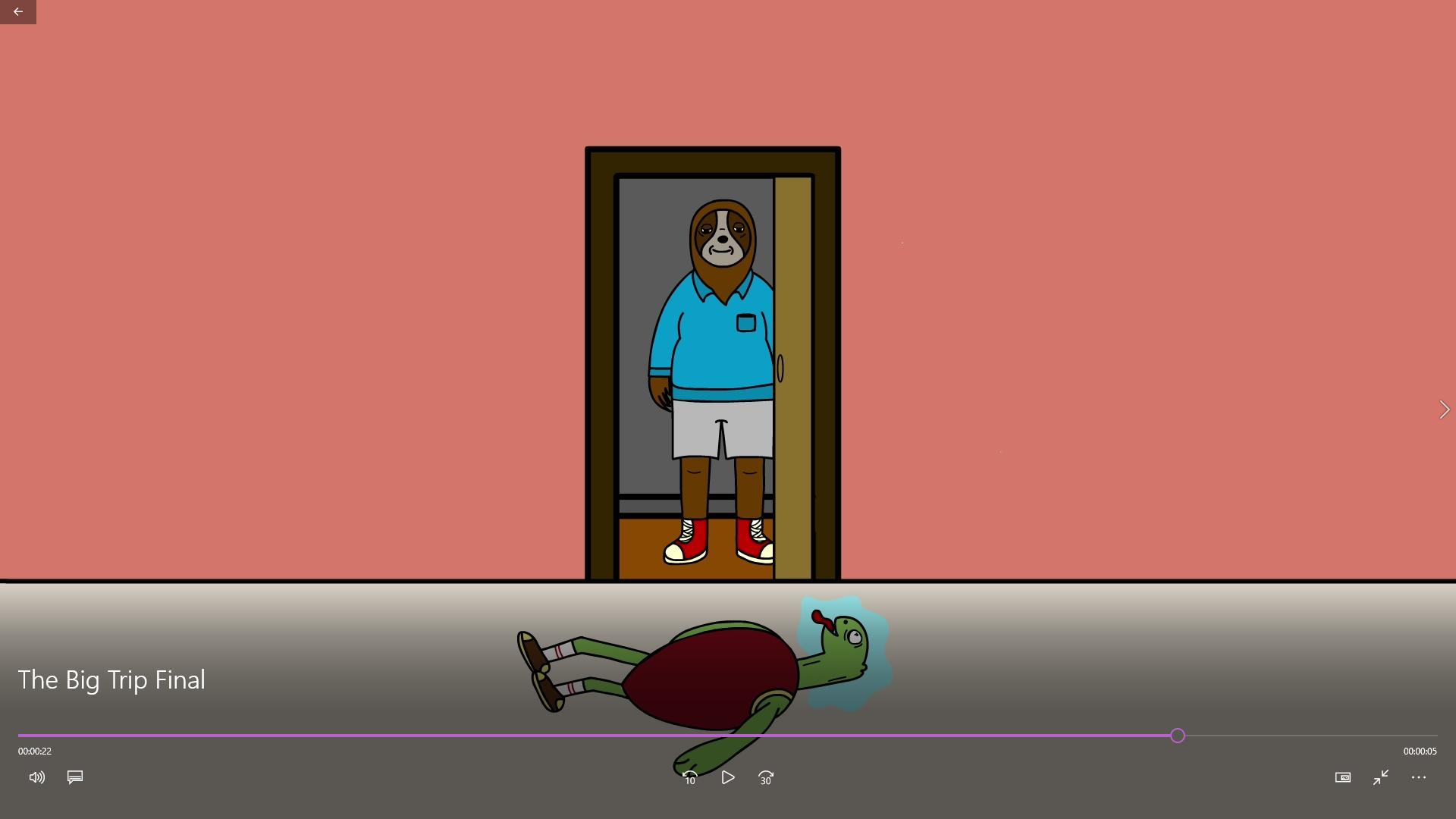
When animating I was struggling with finding a way to transition from space back to Terry tripping on the floor. I did this through the use of a smash cut. So basically the space scene ends with a shooting star coming towards Terry. The next scene then begins as the star is moving and the star turns into a fly which is flying around Terrys body as he trips out lying on the floor outside Reece's house. Later on I when adding the sound effects I synced a loud car horn as this smash cut happens to help emphasis that it cuts back to normal reality. At the end of the scene I gave Terry a generic shake just to give the scene a bit of movement. I also just think it looks really funny as he moves in such an odd way and overall just adds to the humour of the animation.
For the final scene I was able to reuse the background of the first scene, this saved me a lot of time and was very helpful. In this scene the only movement I have is a slow close of the door as Reece leaves Terry to just trip on the floor outside his home. I decided to only have this movement as again I think it adds to the overall comedy of the animation and also keeps the animation from getting too complicated. I think its a great scene to end on and I am really happy with how it turned out.
Final Animation
Before I exported my final animation I went though and coloured it all in. This process wasn't too bad as I just wanted to get the block colours down so I could go back and shade and add more details at a later date. After this I took it into Premiere Pro were I added some sound effects. I choose to just add some general sounds along with some background noise. I felt the space scene needed something to show that it was "the multiverse" so I decided to add a whisper of "Welcome to the multiverse" just to help hammer that home. Once I was done this I was able to export it and call it finished. Watch the final Animation Below!
Final Reflection
Overall I am extremely happy with how my animation turned out. I think it is quite humours and other people have found it quite funny, which I was going for so this was really nice to hear. I have learned a lot about the processes which needed to be undertook during creation and also the industry standard software which I used throughout. While I am very happy with how my animation turned out there is definitely a lot I would change to do differently in the future.
1. I wish I used the squash and stretch technique at least once in my animation. I think it would of been a good way to get more comedy across and could of really benefited the animation as a whole.
2. Choose a colour palette before I start colouring in. I just randomly started choosing colours when I was finished the line art and started colouring in different aspects. I would definitely sit down and choose a precise colour palette in the future as I think this would make the animation look better overall.
3. Make use of the in-built Camera! Adobe Animate comes with an in-built camera which allows users to zoom in and out certain layers if they need to. I should of made use of this when I was zooming in on Terrys face, however at that time I didn't know it existed.
4. Plan out every layer you need ahead of time and name them appropriately. Not naming layers was a real pain when I needed to find a specific one.
5. Stop being so ambitious in the planning phase. I know my drawing abilities are not the best. But I get way to excited in the planning phase and greatly overestimate what I can actually achieve when it comes to animating. I need to be realistic with what I can do and this should help smooth out the whole animation process.
6. One last thing I wish I added into my animation was more realistic character emotion and movement. I have choose two very slow animals but in my animation there is no indication that they move slowly at all. Although neither have very much movement, I would of loved to include a scene which shows both of them just be slow animals who just wants to trip on some shrooms.
As I said I am really happy with how my animation turned out and I hope you find it just as funny as I do. It was a wild ride throughout and something I am looking forward to getting better at in the future. I would love to hear any feedback you have on my animation, or any tips to help me improve!