Each member of the group decided that we would take on different tasks throughout the project. I had never particularly worked on backgrounds before and when I did them for my own animations I generally kept them very basic in detail and colour. I felt this time would be a good opportunity for me to try my hand at proper background art and therefore I put myself forward to do all the backgrounds for the animation. I will be showing my development below and how I made my way to the final backgrounds.
YouTube Research/tutorials
Before I got started on making some background concepts I went off and watched a few different videos on YouTube, to help gain some inspiration. I also watched a few photoshop tutorials to help with the technical aspects of things. The most useful were ones from the creation of Samurai Jack themselves because this was the art style we were going for. Watching Stephen Silver paint the backgrounds by hand was really inspirational and it was amazing what he could do in physical form. Sorcha also recommended a background painting tutorial which had free photoshop brushes for download. The tutorial itself was really useful as it gave me a lot of helpful tips about painting and placing of objects and the brush itself was really good for nature and foliage.
Initial background concepts
The picture to the left is the first background concept I made. I wanted to try and create that classic western shot up the middle of a town, usually used when duels are taking place. I tried creating a few buildings and having a sunset in the back to give off that evening red tone.
I then took the same background and messed around with the colours within it. Trying again to give it more of a dusky look and adding a bit of extra lighting and shading throughout. I added a few cactuses to try and have some more background detail. Overall I think I got a bit too fond of the smudge tool and definitely over used it here, but it wasn't a bad start.
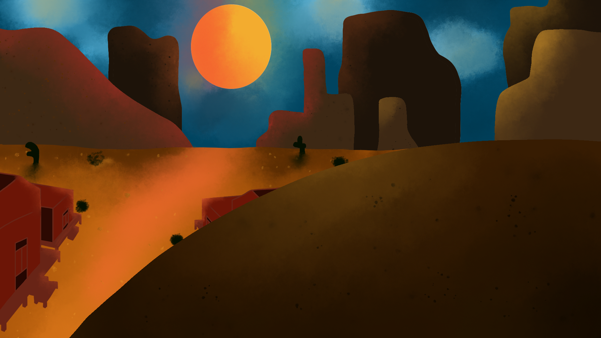
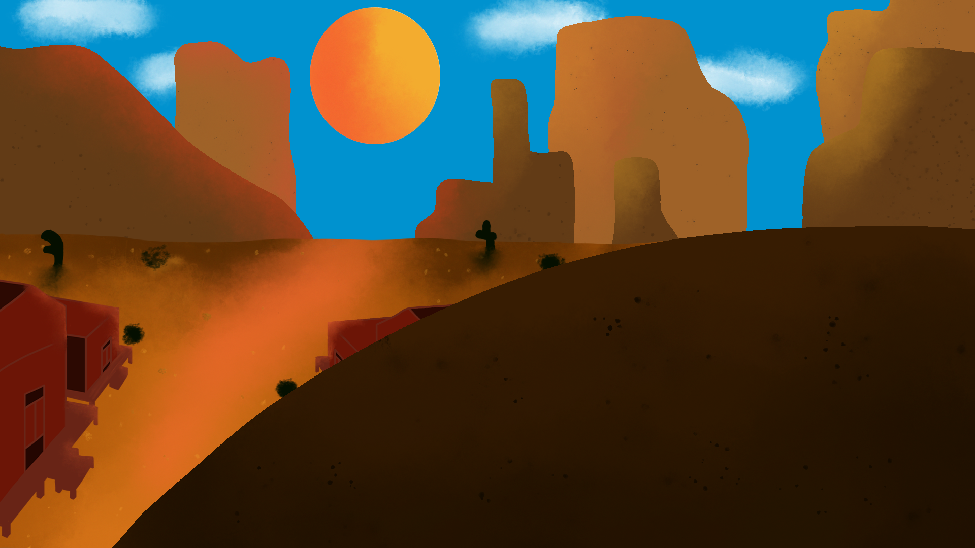
Next I tried to create another perspective for my western town. I got this idea from a samurai Jack background which I will post below. I wanted to try and use this style because then I would be following more closely to that of Samurai Jack. I think this background is better overall as it allows for a more interesting composition. I think the overall lighting and details are a lot better, the ground doesn't look as flat and un-interesting as the first pieces I created. Below I have also included some different variations of this background were I messed around with some colours and lighting.

This was the first background concept I created specifically based off of one of the storyboards. It was my first attempt at a desert cave entrance. I think it was moving in the right direction, the lighting and darkness inside the cave is quite nice, but overall I think it again feels very flat and all of the colours are very samey. At this stage we hadn't decided on a colour palette to be used so I was just creating my own.
This was my second attempt at the cave entrance. In the first one I thought the entrance looked a bit too uniform so I tried adding some different shapes around the edges to try and fix this. I also tried adding a bit of texture to the ground but overall I feel it still has the same problems as my first attempt. It all just feels very flat.
I then tried creating the scene from our first storyboard shot. I added in a rough drawing of the characters just to get an idea of how they might look in place. I think again my downfall was lack of texture. The desert sand looks like glass. I have the lighting but it all looks so smooth and therefore just doesn't look right at all. I do however enjoy the framing in this shot due to the porch being used. I think it looks really nice and with a nicer background it will work really well.
Next I changed up my style and decided to create another dusky evening scene using different variations of a few different colours. At the time I thought this looked really good but I think it falls into the same problems I had all along, that being that everything is too flat. My colour composition is also off with some thing sin the foreground being pretty hard to see. I created a quick mock-up of the sheriffs office just to use and then I used Bens characters as place holders for were they would probably be in the actual scene.
This is my attempt at shot 4. Shot 4 is a close up shot of Little Boots feet as he walks through the desert. I created it using the same colour palette as the previous concept to try and keep them in-sync. In this concept I made use of some downloaded brushes for the bush and twigs in the back. I think they will be pretty helpful in the future for easily creating shrubbery and adding more detail to my backgrounds.
Next I attempted to create a background for the final scene inside the cave, were Small Fry and Little Boot meet. I was really happy with how this background came out at the time and I think it was definitely a step in the right direction. However looking at it now there is definitely some things I wasn't happy with. The overall lighting is too harsh and needs to be a bit lighter around the edges. I also think the floor looks like a chocolate chip cookie so I would probably go back and change that.
I then took the background above and gave it another go making some of the changes I previously mentioned. I made the overall scene a bit darker but made the harsh lighting around the edges lighter. The cookie floor remained but I added some texture by using a lighter colour and making some random patches. I completely redid the back will with a brush I downloaded from Adobe.
Sorcha recommended we download Kyle Websters photoshop brushes from Adobe as they would be helpful for adding texture and more detail to the backgrounds. I did this and it was like night and day. I was able to add so much more texture just by using his range of brushes it was unbelievable.
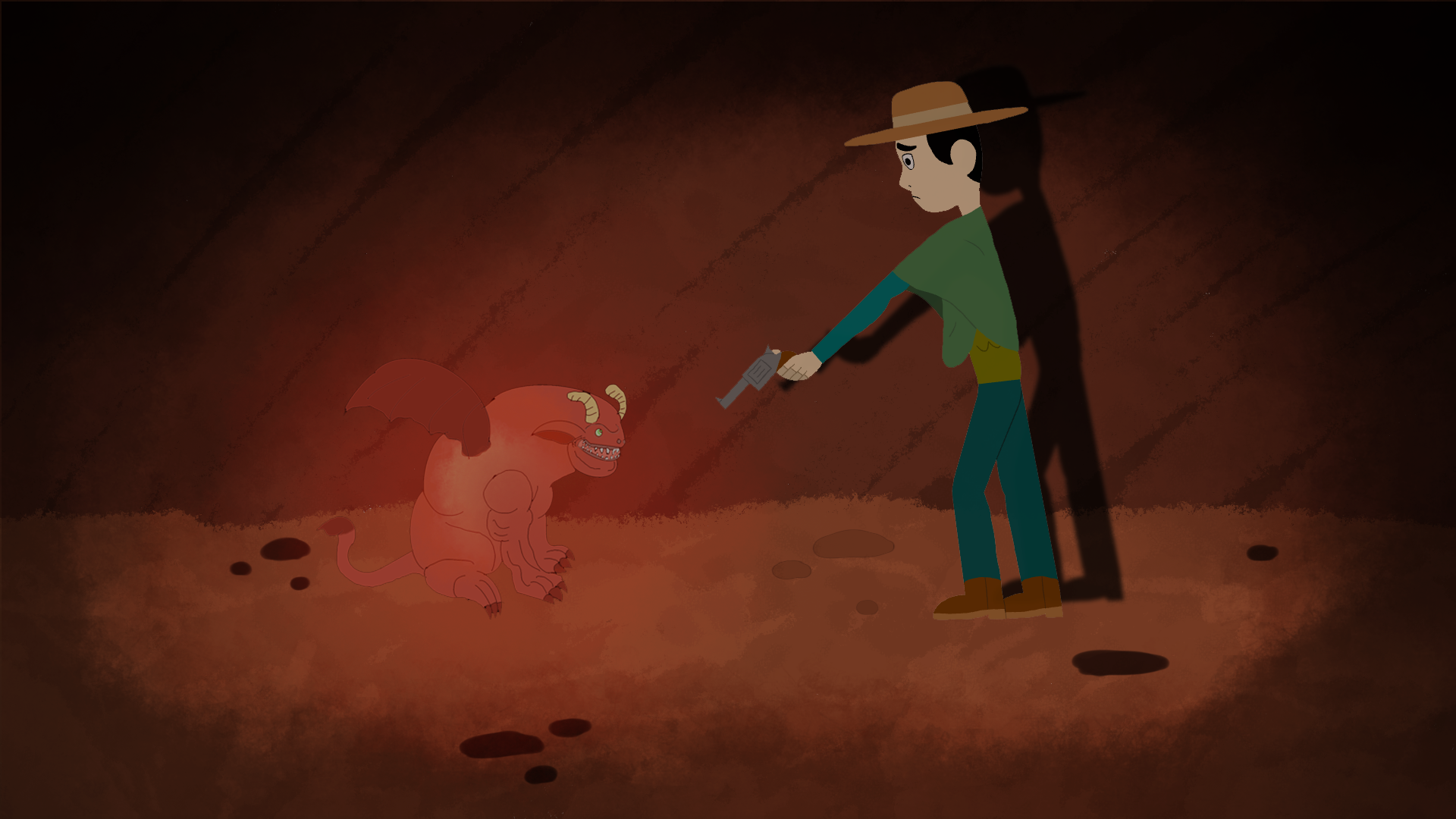
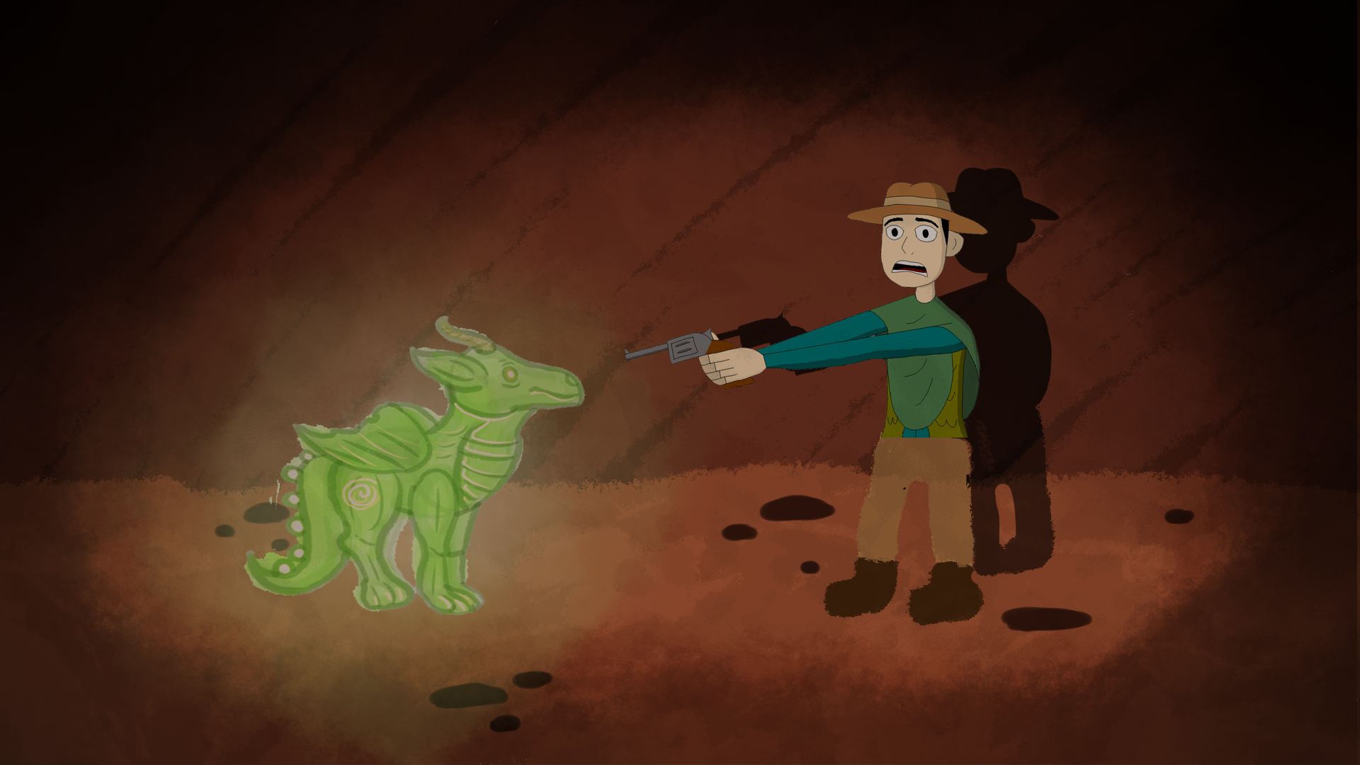
Below are some scenes I created with my teammates character designs on them. The dragons are by Claire and Little Boot by Ben. I put these in so I could get a feel for what the final scene may look like and whether the background would work or not.
Sorcha Feedback and Further Development
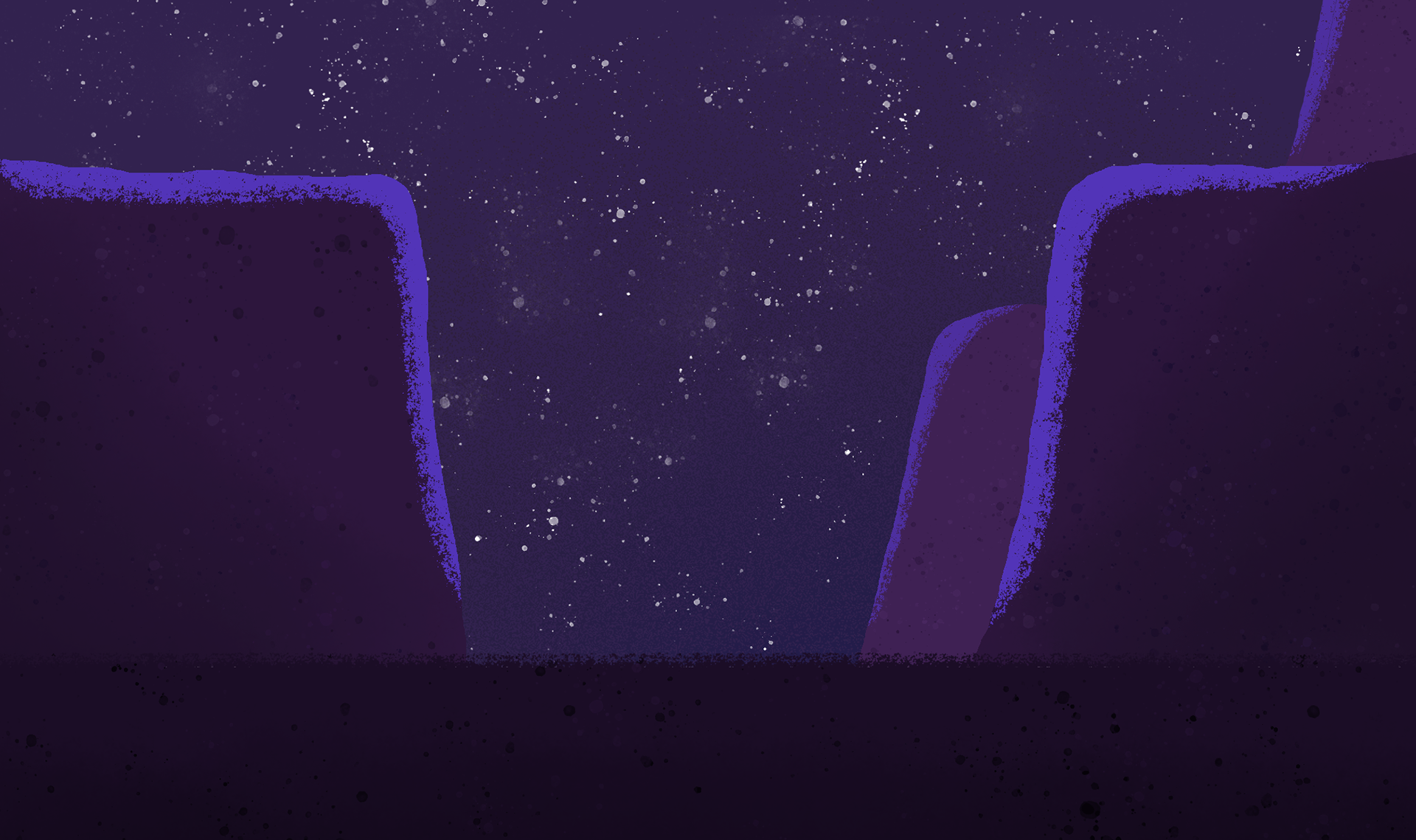
On the left we have the first background I am very happy with. It is one of the Dunes shots from the middle of our animation and I think it turned out really well. It was my first attempt at a night-time shot and I think the colour palette looks great. I got the purple theme from a Samurai Jack background which I will show below. I made great use of Kyle Websters brushes again, using a splatter brush for the stars and also the texture on the ground.
After liking the last background I did, I decided I would try and do the next one in the same style. I really like the purple highlights, as they just really stand out and I think it adds a new layer to the composition. I wasn't as fond of this one as I was the last one so I sent it to Sorcha for some feedback.
Sorcha gave me so much useful feedback on the background which I am extremely grateful for. I think just formatting wise creating a bigger background than needed is a great tip, its something I never would of thought of and I can instantly see the benefits of it.
Sorcha also gave me a lot of stylistic tips, such as how the lighting should be, how to wrap the moon and how effective different layer modes can be. Basically from here how I approach backgrounds will be completely different. It made me realise that I was only using the real basics functions of photoshop and that I can add so much more texture and depth by utilising some of the other tools.
After Sorcha's feedback I went back to my dunes shot and made quite a few changes to it. The base of the shot itself stayed the same but I basically doubled it in size. I realised that this specific shot would need to be twice as long to allow for the pan up and fade from the desert sun in the shot before. I also followed Sorcha and added a nice gradient onto the night-time sky along with some more lighting and texture onto the dunes themselves. Sorcha told me that the closer the object was the more detail it should have, therefore I tried to implement this throughout. I also decided to take away one of the dunes in the back just because I didn't think it was needed or adding anything to the background as a whole.
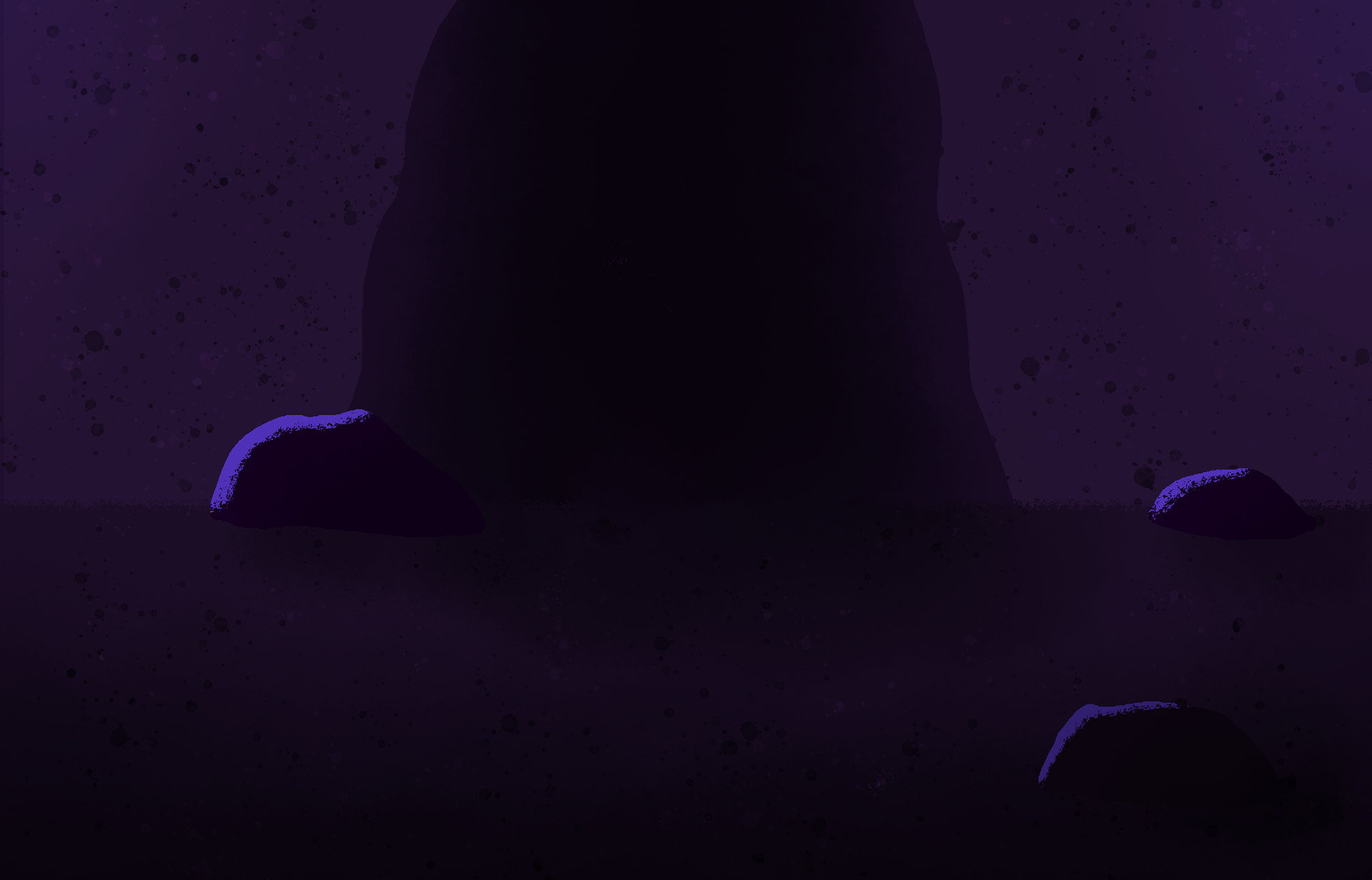
After Sorcha's feedback I had started to have a lot of fun creating the backgrounds so I went on a bit of a rampage and created the next three in one night. To the right are the next two night time shots. One final dune shot and the cave entrance. The cave entrance was a little harder as it was different from the dunes, but using Sorcha's techniques I was still able to create something I am extremely happy with. I know its at night and the colour palettes are completely different but if you compare it with my cave entrance concept art its like night and day, no pun intended.
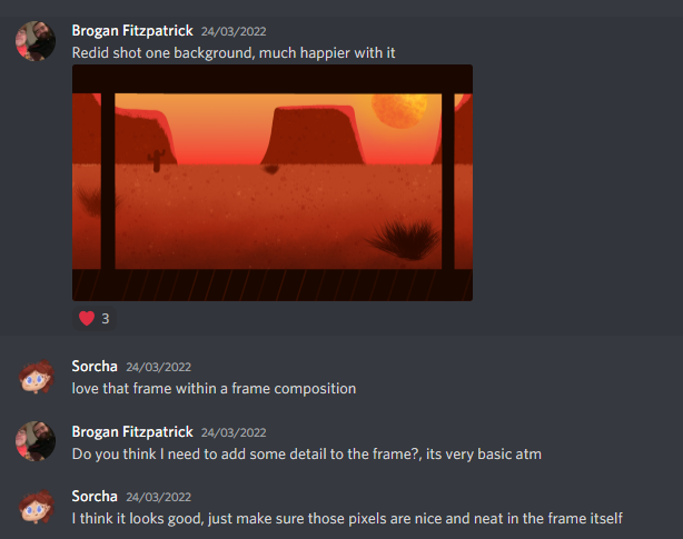
I then went and created a day time scene in this style. It was a recreation of our first shot and I think it turned out really well. I really like the colours I choose and I particularly enjoy the sun. I think it properly looks like a big ball of fire in the sky rather than just a yellow circle which I used previously. I went on to create every. The only thing I would change about this piece is to fix the porch lines at the bottom. I've noticed because I used a round brush they don't go fully to the edge and now I've seen it I cant unsee it. Its not that big a deal but something I'll be more careful with in the future.
Below I have included some screenshots from discord were Sorcha gave me some positive and helpful feedback. It was really nice getting some positive feedback on these backgrounds because I was super happy with them myself and this definitely spurred me on to finish the rest.
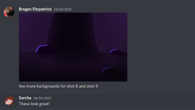
Finally I re-did my incave background. I think it looks ten times better and a lot more vibrant. there is so much more texture throughout and I even added some blurred rocks in the foregrounds to give it some depth. I am really happy with how these backgrounds turned out and I had a lot of fun making them. I will show off the rest in the final outcomes section of my blog.
Looking back at this piece now there is definitely one thing I would change and that is the foreground rocks need to be exported separately and then layered over the background when all the animation is finished. this allows characters to go behind the rocks and not just float over the top of them. An easy to fix problem but also easy to miss whenever I am not the one doing the animation.
Check the final outcomes section of my blog to see the rest of the backgrounds I made for the animation!
My Mistake
To the left I have included a background I made by misinterpretation. It originally created it thinking it was the background for shot 2 of the sheriff looking out at Lee. However after completing the background and trying to place the Sheriff into the shot I quickly realised that it was in fact wrong and I had completely misinterpreted the storyboard.
My confusion started because the storyboard showed the sheriff standing beside a lined box, which I assumed was the fence off to his left. However this was actually the barred window on the sheriffs office behind him. Once I figured this out it made far more sense as I was really struggling with the perspective of this shot compared to the sheriff.
I still wanted to show off this shot though as I think its still a good background and is well developed. It just has no use now.