For this project we have been tasked with creating a pitch bible for a 4 part Netflix Animated series. The series can be about anything we want and the pitch bible should detail the synopsis, character and environmental visuals we want the should to sue and include. My Pitch Bible will follow the check list below:
1. Tagline
2. Synopsis
3. Title Card
4. Characters
5. Episodes
6. Interior/Exterior Environments
7. Production TimeLine
Below I have uploaded a finished version of my production bible.
Animation Overview
The Name of my animation is "Home Grown" and it is a dry slow burning comedy series which follows the everyday life of Phil as he makes his way into the world of drug dealing. Although quite a dark subject the animation will stick to Phil's everyday struggles and inabilities to cater to his plants.
I have taken a lot of inspiration for my animation from shows such as "The US Office" and the "detectourists" a BBC show. Both of these shows feature and use the kind of dry, slow burning comedy I want to use throughout my animation. It was important to me to go down this route as I wanted to create something which didn't include the standard laugh tacks or over the top jokes.
Below I have included my tagline and the synopsis for Home Grown. Again taking inspiration from the office I have tried to keep these light hearted and interesting, to try and draw in the viewer.
Title Card
For my Title Card I wanted to create something really simple. I had this vision that the title could appear at the opening of the animation and then slowly fade away with the animation coming into view behind it and then this being the beginning of the episode. I feel that this helps to set a good scene for the episode and along with maybe some kind of audio could work really well to start each episode off. I got the inspiration for this kind of opening from the new BBC show "Conversations with Friends". In the show the title appears on top of a scenic background shot and then fades away and the episode begins. I have tried to indicate this fading through the use of a lower opacity on the background. Each episode can begin with this and then a cold open shot of Phil's home.
For the title card I again have taken inspiration from the simple nature of The Office. I played around with a few different more complex ideas using sketches and pictures but none of them felt right for what I wanted the vibe of the show to feel like. So I felt the simple text and block font was the best way to go.
Episodes
For the project we had to create 4 episodes in total. I knew that I wanted Home Grown to be this mundane yet comedic show. So when coming up with ideas for the episodes I tried to think of the most basic tasks that someone growing weed in there home might come across. I wanted to hit all the normal well known problems so that on some level people could relate.
When writing my episode briefs I took inspiration from the detectorists and tried to use language which I felt described the episode and made it sound interesting but at the same time completely uninteresting to the point were it is interesting again. That probably makes absolutely no sense to most but in my head it makes complete sense and I knew that was exactly what I wanted to do. I tried to keep the briefs short and sweet, just enough to get viewers interested in watching.

Characters
Home Grown is set in a universe were humanoid animals are the people. I decided to go down this route as i wanted to set it in the same universe as my animation Jam project "The Big Trip" were I also used animals as people. Character design and drawing is not my greatest strength and therefore I find it easier to draw animal characters rather than human characters because I think I can be a bit more unrealistic with them overall.
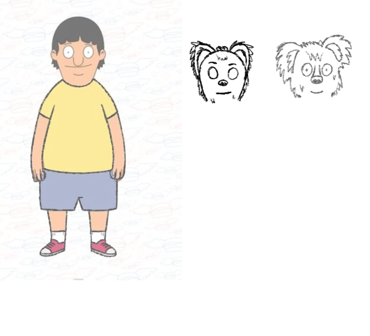
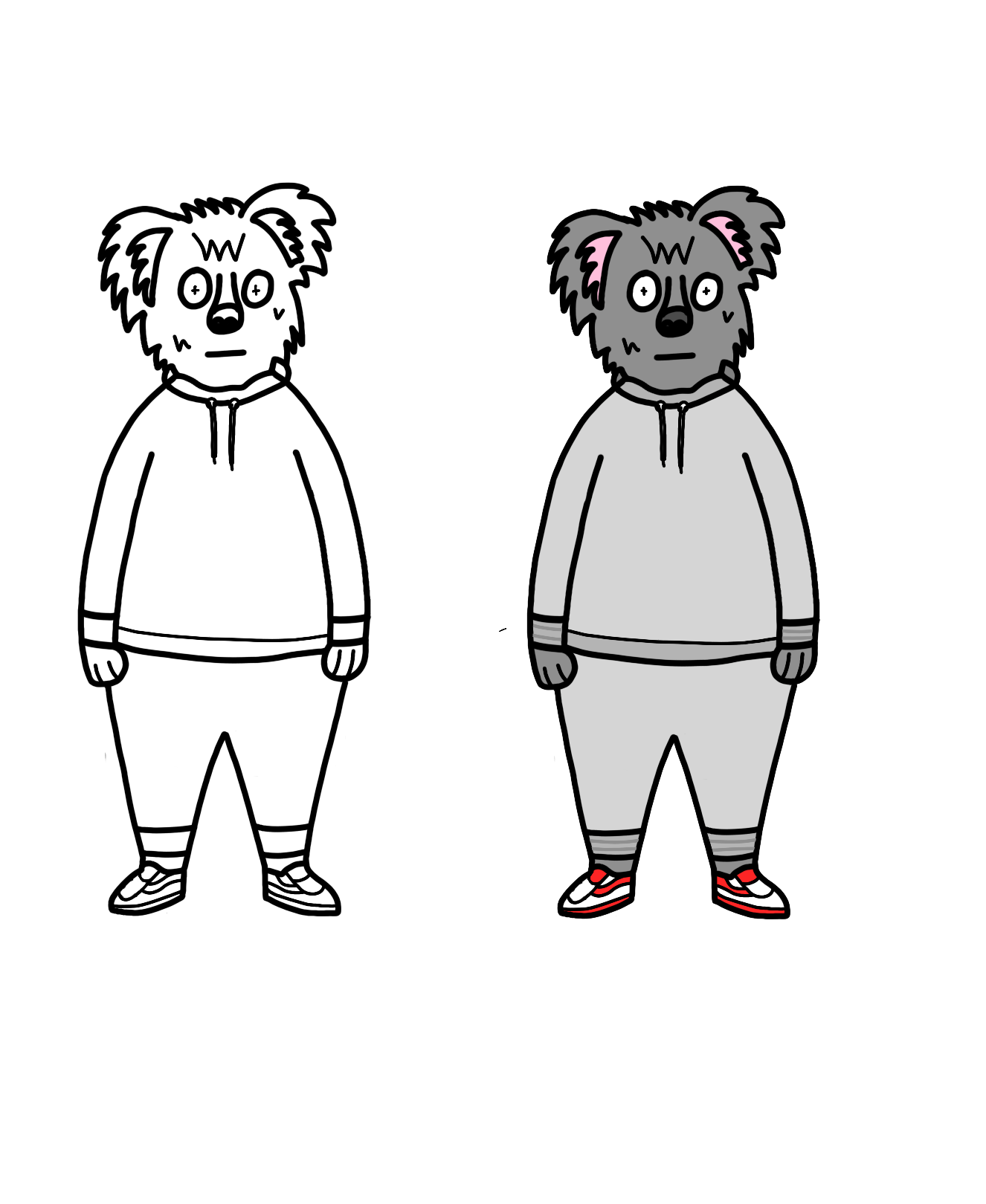
My main character and the guy the animation will be following is Phil. Phil is a small wolf/dog character who religiously wears full tracksuit outfits. Phil isn't the smartest guy on the block and in a lot of ways is far too money hungry for his own good. He isn't hard done by but he is by no means rich. When creating characters I find it a lot easier to find a character to use as reference for body shape. In the case of Phil I used Gene from Bobs burgers. Gene was the first person who came to mind when I pictured Phil's body so I knew he would work instantly.
I have included some pictures below as I sketched out Phil and then his final line drawing and coloured versions. He is by no means perfect but I think he works well for what I need him to be.
My second character is Bernadette. She is Phil's first customer and appears for the first time in episode 4. Bernadette is a local mum of three kids who finds out from her friends that Phil ahs started to sell weed in the area. Bernadette has a very stressful lifestyle between work, her non-helpful husband and her three kids. Therefore she was looking for a little something to help her take the edge off and relax from time to time.
Bernadette in this world is a Giraffe character. I have no idea why I choose Giraffe, I just did. I tried multiple other animals but I just couldn't get them to look right at all. Then I tried Giraffe and it just seemed to work. The character design is simple overall as I just wanted to give off that everyday working mum look. Nothing to fancy, but again does what she needs to do. I took inspiration for Bernadette's body shape from another Giraffe cartoon I will show below.


Exterior Background
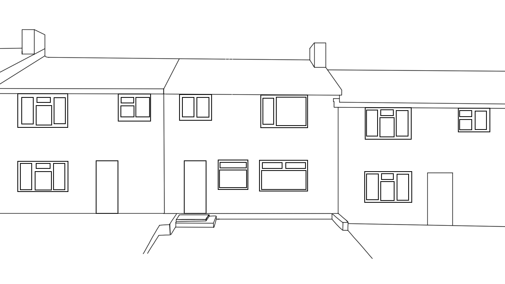
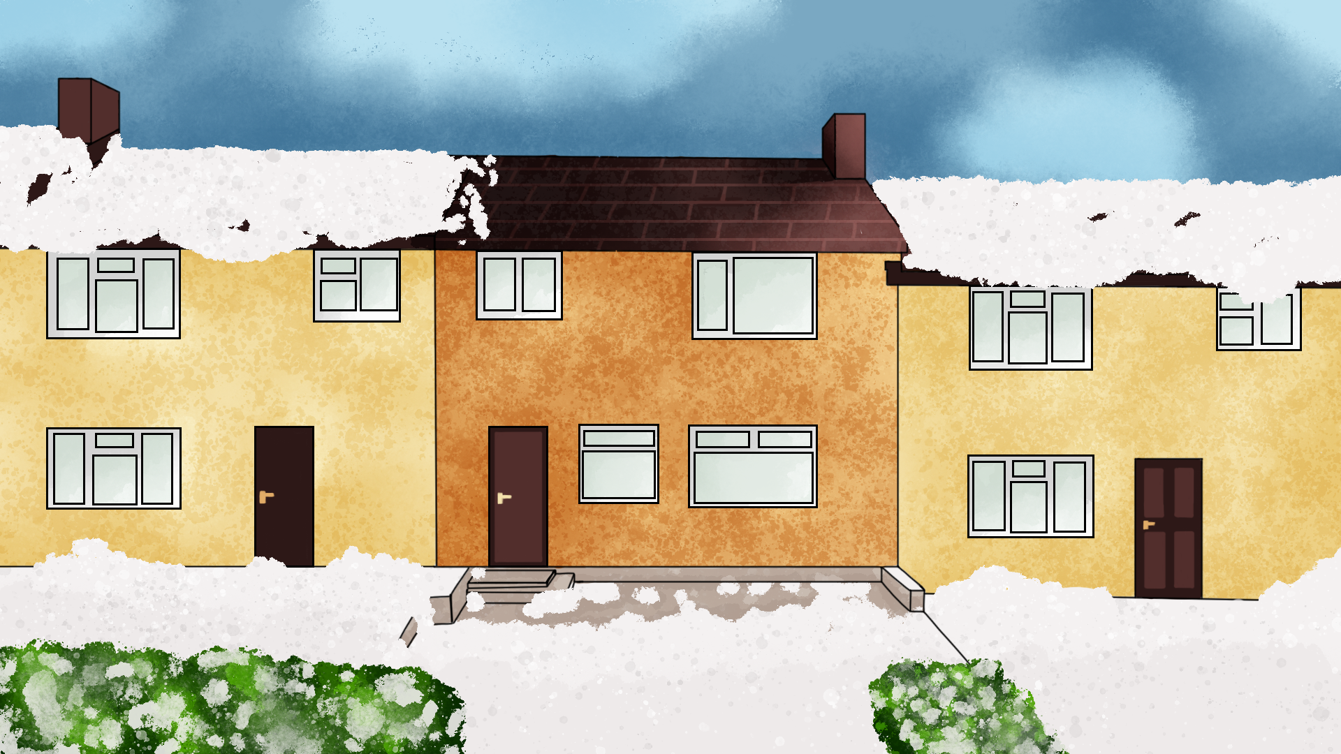
For my exterior background I had a very clear vision of what I wanted. There is this classic picture that circulates around every so often when it snows. That is of a row of terrace houses with roofs covered in snow and then this one house with almost perfectly no snow on it at all and the picture just says guess which one of these houses grows weed. This stereotype is the exact one I wanted to get across in my exterior shot of Phils home. So I set out to create a row of Terrace houses covered in snow.
I think that this exterior shot actually turned out really well. I wasn't sure how it was going to go but I am really happy with it. I just based it off of some real life terrace houses and then added in snow and a few other details. Overall I tried to keep the details to a minimum as I wanted this to be the style of the animation. I tried to give a bit of shading and texture to add a bit of depth and more colour. With the snow I broke the line art by going over the top of it. I think this just looks better and allowed me to create snow mounds easily.
Interior Background
My interior background depicts what I think Phil's Weed farm would look like. I tried to again use all the standard stereotypes for this such as big heater lights and lots of plants everywhere. I wanted to make it look like Phil wasn't just starting out but wasn't a pro at what eh was doing yet so I didn't fill the room with plants but I gave him an acceptable amount. His setup is good but not amazing, just yet.
Again I tried to add depth through the use of shading and texture. I think it looks really good in some parts but is lacking in others, such as the walls. I struggled a bit with perspective and I do think that overall the perspective is off but I think it still work sand looks good. Perspective room drawing is definitely something I need to take a closer look at in the future.
Production Plan
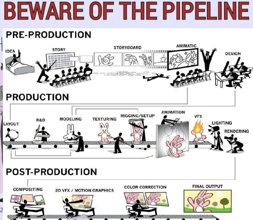
I actually based my production plan off of a meme which was sent into the animation discord. I will show it below. Basically the meme outlines the production pipe line for a 3d animation project. My animation is 2D so I adapted it but I felt that it broke down the pipeline really well and had all of the appropriate different stages. So I used this as a guide for my own. When it came to allocating time to the production I gave us 1 year to work with. I'm not sure for this sort of thing how big the team working on it would be or anything like that so I was just making general assumptions on how long I think it would take a reasonably small team to make the show and how long I would want to spend on certain tasks in order to get them to the point were I was happy with them. I believe the most time should be given to the actual production of the animation as this is the most crucial moment.

Reflection
Overall I am happy enough with my pitch bible. I think that I have a strong animation concept and I am really happy with that and how I view the show and the story. I think I have good characters and backgrounds etc but I think that the thing which needs the most work is the actual Pitch bible itself. I wish I went more in-depth and di more drawings. For my characters I should have shown character turnarounds and different facial expressions. and overall I think it could just look nicer. Currently I think it follows my simple theme well but I think for this kind of project making it look that bit nicer and more interesting would of worked better overall.
The bible is supposed to show everything that is needed to pitch the show and right now I think that mine is too simple. If I had of just went that little bit more into detail and showed a little more expression I think it would have turned out a lot better. It also would of been far better at selling and showing off the story I want to create. In the future I would definitely make these changes as I think they would be hugely beneficial.