Final Outcomes
For my Animation Masters Major Project I created a rigged character in After Effects using the RubberHose plugin. I have detailed my journey below.
Initial Idea
Going into the Major Project I knew exactly what kind of Animation I wanted to undertake, this was 2D rigging. I knew I wanted to expand my knowledge in 2D rigging because of my adventures with it last semester. Last semester was a tough experience when it came to rigging and I wanted to be able to prove to myself that it is something that I can do and something which I can use to make animations I am happy with. When looking at examples of projects from last year I seen that Deborah had also created a 2D character rig for her major project. With her final outcomes being a walk cycle and a rig breakdown. I found this extremely interesting and decided that I wanted to create something along the same lines and would use this as a good example moving forward.
Straight away I knew that I wanted to create some kind of stylised character. Something that would allow me to create odd movements away from the normal, as this would hopefully give me more creative freedom with my project. A Major animation I was interested in as a child was Adventure Time and I have been looking at the original production plan that was created for the show, so the Adventure Time style was very much on the mind. Thinking about its characters and the way they moved seemed like a perfect place to start.
Character Design
My initial instinct was to create some sort of knight character. I'm not really sure why, this is just were my brain went so I followed it through. I looked at the knight characters in Adventure time and i really liked the look of there armour. They have a lot of exaggerated features and generally just weird body shapes, which I thought could allow for some weird movements. Another big bonus was the simple design they had. Each character was really just made up of a few big shapes, without many complicated aspects. I struggle with the finer details of character design so drawing simple shapes is a good place to start.
I began by doing out a few sketches in photoshop based off of the characters above. I had noticed that most of the character had quite a big middle and then really thin arms and legs so I tried to recreate this in my designs. I played about with a few different designs for the helmet and body and finally settled on the larger fellow at the end as I thought I would be able to create quite a unique animations based off of his size alone.
I then took this sketch and cleaned it up, producing a clean line art version. I decided to give the character a rather large sword across his back as I thought that further down the line this would again give me some interesting movements to animate. Something about an overly large sword seemed interesting and I think it will be good fun to mess around with when animating.
I then tried to do a 3/4 point of view for my character. The perspective is a little bit off but I think it is enough for the purpose of seeing how he would look. I also quite like how its kind of off, gives it more of a stylised look which I might try to work with in the future.
After I completed my clean line art sketches we had a class were I was able to show off my work. Everyone seemed to like the initial sketches and character design. Some feedback from Charlie was that when designing a character you need to take into consideration the animation you're going to be doing with them and in turn creating an animatable character. Therefore she suggested that I change a few elements such as the shoulder pads. She suggested to make these a lot bigger as it would help to cover the arms joints during the animation process.
I took this feedback onboard and went into Illustrator to create a new line art for my character. I choose illustrator this time instead of photoshop as it allows vector based graphics which I knew would be far easier to work with later down the line when I move my character into After Effects. When colouring illustrator allowed me to just auto-colour a block which is extremely useful and time saving. During this clean-up process I decided to make a few changes to my character along side the shoulder pads. I made the characters build a lot smaller overall. I decided that I wanted to create a stylised animation with his arms and legs rather than his body shape so a smaller build will help with this. I also took out his knee joints, as again this will help creating a cleaner and more fluid animation further down the line.
Lastly I simply coloured the character in with some basic blue shades. I think they work well and I tired to keep the character colours as muted as possible. I didn't add any shading but instead opted to add some detail just using black lines throughout. I'm really pleased with how the character has turned out this far and I am looking forward to see what work I can create with him.
Once I had completed my finalised character design I drew up a side view for my character. I did this because I wanted to take him into After Effects as soon as possible so that I could get messing around with the rig. I think the side view turned out quite well and I think his overall body shape will work fine for what I need it too.
Before I could take my character into After Effects I had to separate each piece of his body out into different layers inside illustrator. This means that when I bring the file into After Effects each Piece can be its own layer and all of it will be separated out correctly, allowing me to move what I want and not just the character as one big image.
Rubber Hose tutorials
Having never used Rubber Hose before I set off and loaded in up in After Effects. I choose to use Rubber hose over the likes of Duik because I had tried to use Duik last semester and found it extremely complicated and awkward to get any real result with. I needed a fresh start, and Rubber Hose sounded like something I could get onboard with. It comes with a very simple interface which can be added to the After Effects screen.
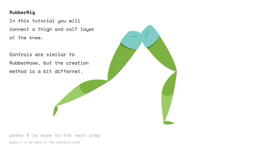
Rubber Hose comes with its own inbuilt tutorial which opens when you first load it up. This was really helpful as it showed me the basic concept of the program and also how to use the basic mechanics such as the controllers. The tutorial also teaches you to understand the hose effect panel which lets you change hose length, bend direction and other effects the hoses can have. This was useful as it meant I didn't have to go searching for these kind of tools later on down the line. The tutorial also showed off how to use RubberRig another tool with the RubberHose plugin, however this is not something I am focused on learning right now.
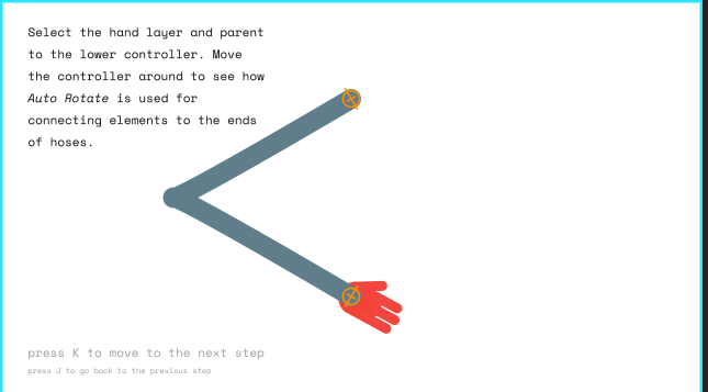
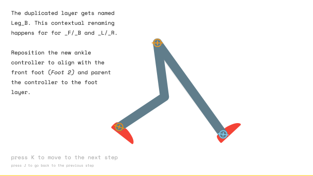
Since I had never used Rubber Hose before I felt it would be a good idea to follow some tutorials so that I could get to grips with the basics of the plugin. I found this tutorial on YouTube by Holmes Motion which I thought was really beneficial.
The tutorial taught me how to create a basic walk cycle but also how to add a bit of weight to the animation. The gif to the right is my final outcome and I'm extremely pleased with it. I followed the tutorial exactly and I find the design choice they used really nice and also was really easy to follow because of how simple they kept it.
Next I found another tutorial. This one made use of a cowboy design and because I really like cowboys this rather intrigued me. This tutorial was again for a walk cycle but I felt I needed the practice with a more complex character design. Also you can never practice too much!
The gif to my right is the outcome of my second tutorial. The video creator gave us the graphics file so I didn't need to create the cowboy myself. Again another useful exercise and this time more complex. I think again the walk cycle turns out okay, it definitely has its flaws but I think it looks pretty stylised. The back leg needs a bit of work and if I was to do this tutorial again I would try to change this up.
Walk cycle
I took my character into After Effects and hooked him up with Rubber Hose limbs and tried to create my first walk cycle. There is a lot of problems with this but for a first attempt I think its a good start. I tried to focus on just moving the legs but I think I made the age old mistake of only creating half a walk cycle. this is evident in the gif as the character takes very small steps and just looks really awkward as a result.
Off the back of my first attempt I went again. I slowed the walk right down to about half the speed of the first one. I then extended the steps in which my character was taking. I wanted to exaggerate his legs and made sure that they crossed each other with each step, The result is a very stylised slide almost. Its pretty funky but not really what I am looking for. But I really like it overall for what it is. Gives me cool dude walking into a bar in a movie kind of vibe.
One of my main problems so far was that my characters feet were not able to bend, this meant that they were really stiff and couldn't land properly.
To solve the feet not bending properly I went back into illustrator and separated the feet into two separate parts. These would then be my ankle and shin. Now that the ankle was a separate part of the foot I was able to rotate it while the foot is moving. This allowed me to create more realistic foot movements and ankle rolls.
My first attempt with this didn't go so well. Again I fell into the trap of only doing half a walk cycle, a problem I found so easy to hit again and again. However it was handy to mess around with the ankle and see what kind of movement I could get with it.
Off the back of my last failed attempt I started again and this time created a walk cycle I was extremely happy with. I think the feet move very nicely and the ankle bends gives it more of a proper walk cycle feeling. The foot rolls allow the foot to drag along the ground a lot more which helps imitate contact with the ground, as well as this it allows the foot to bend upwards when taking a step which allows me to follow the natural arc of a footstep.
Once I had the feet were I wanted them I started to mess with the arms. I simply wanted them to swing back and fourth and this is exactly what I did. I think they give off a good range of motion and follow the arc of the walk cycle. Finally I wanted the body to move along with the feet and wanted to emphasise on the downwards step of the left foot and really make it look like the character is pushing off for his next step. To do this I moved the body position up and down very slight and also rotated it back and fourth to give this sway effect.
Next I added some more movements to the knights body. I started with the lower chest piece. I felt that messing around with the movement of this gave the walk cycle real weight and looked really good. So I moved it up and down to its extremes as the knight was walking and rotated it so that it moved even further. I also offset the timing of its movements so that the overall walk cycle wasn't equally timed.
I also moved the top shoulder piece to rotate with the arms. As the arms moves this should move to reflect that so I made it and I think it turned out well.
I was extremely happy with this Walk cycle and really wanted to continue working on it. The last things I would have added were the movement of the back shoulder piece and some eye blinks for secondary action. However I ran into a problem with my After Effects file which I will discuss below.
I thought this walk cycle moved really well and had this nice bobbly effect to it. It gave off a really stylised march and I'm really disheartened that I couldn't continue to work on it.
During production I realised that my Illustrator file was created in size a4 and not in a HD format. Were as my After Effects file was using 1920 by 1080 HD ratio. This meant that each time I brought my character into After Effects I had to scale him up, which isn't a particularly big deal quality wise because its a vector graphic and can be scaled easily with no problems. However I noticed that each time I was finding it hard to scale the character the same amount each time and this was leading to sometime parts of him being bigger than others in different files so there was no continuity between them.
To fix this I decided I would change the size of my illustrator file to 1920 by 1080 and then every time I brought the character in I wouldn't have to mess around with the scale of him. However I didn't realise that this would change the scaling of the character within After Effects compositions I had already created. Because it was a live file when I made the changes in the Illustrator file, After Effects auto updates, one of Adobes really useful features whenever you realise its going to happen. So When I went back to my After Effects file I was met with a character completely out of proportion and just a mess. Despite my best and multiple efforts to fix him I just couldn't get the file back to were it was before and eventually gave up. Luckily I had already exported the gifs you have seen above.
I really liked this walk cycle and I had a lot of fun messing around with the weight of the armours pieces. I have learned a valuable lesson here and it is something I will definitely not do again in the future. Always save multiple copies of your files also! You never know when they could come in handy.
Run Cycle
Next on my agenda was to create a run cycle for my character. I was feeling confident after how my walk cycle turned out but I still went to YouTube to find a tutorial for help. this tutorial was particularly useful as it gave me a good idea for the arc of the leg movement and what that should look like. Really walk cycles and run cycles aren't that different and I found the run cycle a lot easier.
On the left we have my first run cycle attempt. I was really pleased with how it turned out. I felt that it gave off a good sense of action and urgency. I think the body parts move freely and look good.
Feedback from Sarah and Charlie was to exaggerate the leg movements as right now they don't go very far forward on the step. They also said that the sword wouldn't go that high up while running due to its shear weight. I would look to fix these in my next attempt.
I went back into After Effects and tried to take onboard Sarah and Charlies feedback and I think it work out really well. Lowering the sword makes it look like it has a lot more weight and that it could actually do some damage if needed. I also exaggerated out the leg arc to give a more stylised animation. This was actually the really easy to do and is the beauty of RubberHose.
I'm Really pleased with how my run cycle turned out but there is definitely some aspects I would change such as the movement of the back arm. I think it comes up to high and should be lower. I also think the whole animation is to equal and something needs to be offset to make it now all seem the same. This is something I will look to improve upon for the future.
Sword chop
My final ideal movement for my knight was to create him walking along and doing a sword chop. To start I decided I would try to create him walking while holding the sword. This led me to create a two handed version of the sword in illustrator. I did this by putting the hands themselves onto the sword and then had the hands and the sword all as one piece in the composition. My initial attempt was to create this sort of slow stealth walk cycle were he had the sword and I intended to add a swipe of the sword once I had got this correct. I think the outcome of this was okay but the feet still needed some work. They don't really touch the ground how I would like.
Next I made the movements faster, about double the speed and made the steps more dramatic. I also added some body movement which resulted in movement of the sword. I think this looks well as it is unlikely that the sword would remain really still while walking, even if you are crouching and trying to be sneaky. I much prefer how the feet turned out in this version, I think they touch the ground a lot better, but still need some work. I however don't really like how long the legs are and feel that the length in the first attempt look better. Ultimately I think that a mix of the two gifs would work best, the steps of my second attempt along with the stance and slower movement of the first attempt would create a much better movement.
Sneaking characters is something I want to give more look in the future as they are quite interesting and it is fun to mess around with a rig to give you the desired sneaking affect.
During creation of this animation I noticed that at some angles the left hand wouldn't bend correctly with with the right hand. This is because I had the right hand controller driving the movement and the left hand controller parented to it so that it would follow. However in some instances such as the position on the left the left hand wouldn't move how I wanted. I knew this approach wouldn't work for what I needed it to do so I went back to the drawing board.
I went back into illustrator and separated the hands out from the sword, this meant that each hand and the finger tips of the right hand had to be different pieces if I wanted it to look correct. The left hand was tricky because i needed the thumb to be on top of the sword so it looked like it was being held and I also needed the fingers to come out the other side. My solution was to create a gap between the rest of the hand and the finger tips and the sword could slide in the middle, underneath the hand layer so the thumb is on top. However this plan didn't really work either.
In-order for the the fingers to appear out the right side underneath the sword they and to be on their own layer. I thought parenting them to the rest of the hand would keep them in place but unfortunately they could not keep up. At certain points the angle and movements of the finger tips was slow and wrong and it just didn't really work overall.
After feedback and a meeting with Sarah she gave me some tips to try to such as permanently adding the thumb to the sword or adding an extra sword handle to stay in place and help cover up the misplaced digits. However after some fiddling and trying I decided that I would give up on my ventures with a two handed sword and move to a 1 handed weapon.
At the start I wanted to create a sword which was overly large for no reason and looked heavy. My knight doesn't look like he has the strength to wield the sword with one hand but its my animation and world and I have decided that he indeed can and shall do so from here forth. He can also use it two handed if he pleases, there is room on the handle for both.
I then went into illustrator and removed the bottom hand from the file. Already it looks a lot better and less clunky. I think the overall design works well.
Now that I had moved to a one handed sword I decided that I would ditch the walking sword swipe and go for more of a standing sword chop. Since only 1 hand was holding on to the sword I needed something for the other hand to do. I took quite a lot of inspiration from Obi--Wan Kenobi's lightsabre stance. I also think the arm would potential move in this direction naturally as it acts as a counterweight for the heavy sword.
I had a initial version of this animation but I forgot to export it before I continued to work on it and therefore have no gif for it. But off the back of it I was given feedback from Sarah and Charlie and that was to move the sword further down the back of my knight as this will help show the weight. Also to make sure that the sword moves up slow and comes down fast. Again to show off the weight. I have tried to include both of these bits of feedback into the animation and I think it looks great.
As the sword chops down I wanted the arm to extend a bit more than its normal length. I think this both shows off the beauty of RubberHose but also helps continue the stylised feeling I was going for. The normal limb dimensions can be made longer and shorter as I please.
Background
For my background I wanted to take inspiration again from Adventure Time. As I based my character design around this show I felt that it would be best fitting to try to create a background in the same style so that it all fits in.
I knew that i would need a background which moved in the back to simulate walking and running in my aniamtions and had the idea to create a forest which moved behind my character. I took my initial inspirations from this picture to the right.
Picture Source (WallpaperUP. 2022. Adventure Time. [online] Available at: <https://www.wallpaperup.com/66529/Adventure_Time.html> [Accessed 8 September 2022].)
This was my initial attempt at a background. I didn't get very far in but I wasn't really vibing with how it was going. I tried to recreate the rounded body shapes of the trees but it just felt clunky and wrong. I decided to look for more inspiration and start again.
Next I again took inspiration from another adventure time background. I liked the spikey mountains and the numerous hills and thought I could potential create something a long these lines easy enough. So I went into photoshop and tried to create something.
Picture source (Flare, W. and Ice mountain wallpaper, A., 2022. Ice mountain wallpaper, Adventure Time HD wallpaper | Wallpaper Flare. [online] Wallpaperflare.com. Available at: <https://www.wallpaperflare.com/ice-mountain-wallpaper-adventure-time-wallpaper-251177> [Accessed 8 September 2022].)
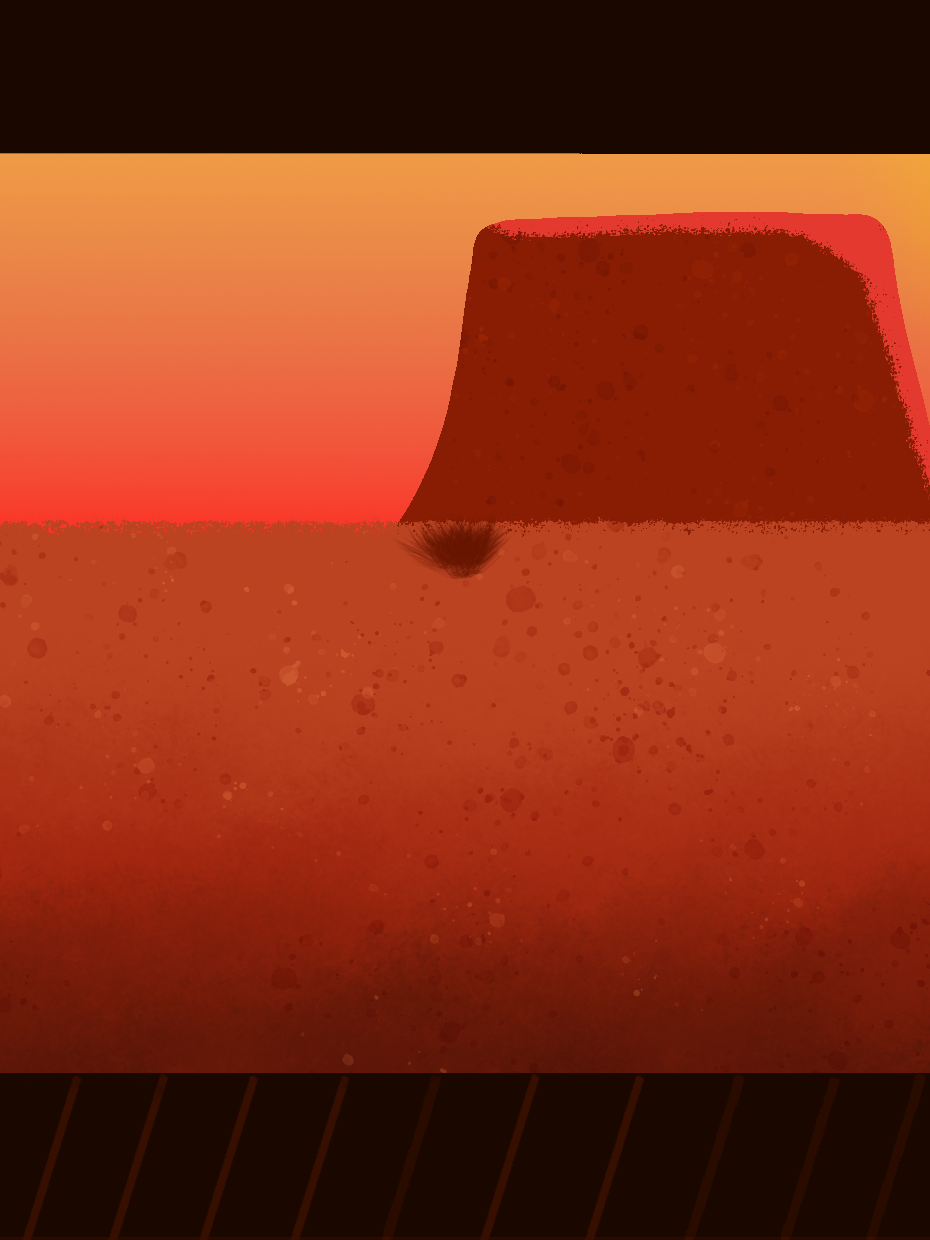
This was the background I came up with in the end. I think it works well and I am pleased with how it turned out. I wanted to have something close in that foreground so decided that a tree was best suited. I also included mountains and some sort of evil land in the background to show off something in the distance.
When I took the background into After Effects I noticed that it seems very bright when my character was a on top of it and this made him stand out a good bit. To help reduce this I went back into Photoshop and reduced the saturation of my background. I have shown the final result below, I am really pleased with how it turned out.
Lastly because I wanted my background to move behind my character so I needed to split it up into different layers. This meant merging all the corresponding layers into front, middle and back. I could then take these into After Effects and create the paralaxing effect I was after.
I knew I wanted to include a moving background with multiple pieces but I was overly sure of how to go about doing this. So I found this helpful video on YouTube and it helped me understand how the pieces should move and at what pace etc. The tutorial was very easy to follow and I think off the back of it I was able to implement a scrolling background effectively.
Rig UI
The last thing I needed to do for my major project was create a Rig UI and breakdown. For the Rig UI I knew I wanted to make use of joy Sticks and Sliders in some capacity. As it was a program I had never used before I decided I would go and find a tutorial to help me understand it. The tutorial I found was really helpful and explained the plugin extremely well. It didn't seem to hard to grasp so I decided I would try use it.
I decided that I would use a slider to make my character blink as this seemed easy enough to implement. Once I had my eye blinks down I just simply had to highlight the two key frames and click create slider. From here I could create a UI slider and have it on my composition. The slider is really easy to use and simply moves from left to right opening and closing the eyes. I think having the eyes blink is a good piece of secondary action to include and just adds that wee bit more to the animations.
The next thing I wanted to add was a checkbox effect. This is an effect controller inside After Effect and allows you to switch between two different graphics depending on which one you need at that time. I intended on using this for my hand and sword. I wasn't sure how to go about including this so I found a tutorial on YouTube to help me. Off the back of the tutorial it didn't look like it would be too hard to add in.
In-order to implement the checkbox controller I had to add two pieces of code on my hand and on my sword layers. One to make the sword show when the checkbox was ticked for the sword to appear and one to show that when it wasn't ticked the hand should appear. This was quite simple and I followed the tutorial code exactly.
However this did not work for me and I kept receiving this syntax error. A quick google search and I was able to fix my problem very quickly.
I only had to make a slight difference and that was to put the two numbers at the end inside curly brackets. This error happened because the tutorial I was following was a few years old and it appears After Effects have updated the syntax for there coding making curly brackets necessary for it to work.
I tried to create on screen UI for other body parts using joysticks but this didn't really work very well and after talking to Sarah I decided it would be best to just use the inbuilt rubber hose controllers. This means that the rest of my rig is controlled by RubberHose for arms and legs and for the ankles you can create foot rolls by rotating the layers themselves using After Effects properties. Overall I am really pleased with my rig, I find it easy to use and I am happy with how it has turned out. I will include my full Rig Ui video below.
Final Outcomes and Conclusions
For this particular walk cycle I feel very bitter sweet. I had a walk cycle I was really happy with and ran into problems which I talked about above. I spent a long time trying to recreate the walk cycle but I don't think I was able to get it quite were I wanted it, overall it just feels stiffer and not as bouncy which is a shame. However I still think it looks well and shows off the capabilities of the rig. In the future I would probably spend more time on it and possibly add the use of Duik so I could rig the feet rolls with that instead of using After Effects rotation property. While this worked I just think Duik might work better.
The background needs a little bit of work, I used too heavy a line thickness so they seem a lot bigger and darker than the character so I would definitely change that. I would also create a colour palette before hand so that I don't need to mess around with it after drawing.
I think my run cycle actually turned out really well and is probably the animation I am most happy with. However there is still a few things I would change for the future. I think overall it has a good sense of pace but is probably all too even, putting something off time to make it seem more stylised and accurate would be beneficial. I think the feedback I received was good and made it better overall after implemented.
Again the sword smash turned out well and I think it looks good for what it is. In the future I would like to develop it more and potentially add him walking like my original plan, also defending an attack would be cool to see. I would make a few changes to the positioning of the body. I think his change in weight is good and his body moves well but I think at the end if just doesn't shift back to his starting position which it should. Right now his feet don't land properly at the end so it just doesn't sit right. Overall I think each of the animations turned out well and the main problem with them being just that they're too stiff, smoothing them out would help bring them more to life and make them feel more real and stylised, this would be my main point of interest moving forward if I was to continue using this rig.
I think the rig itself turned out really well. I'm extremely glad I used RubberHose as I now feel like I am really well versed in it and could use it for projects in the future. it comes with a really easy to follow UI and the limbs and effects allow for some really cool animations to be made. I think I could of went further with the rig UI by making use of duik for the feet rolls, this would of gave me another controller to potentially create a joystick or slider for. Also in the future I would like to create a face rig as this would allow me to add more UI for head movements, mouth shapes etc. I think I've created an effective rig for the animations I wanted to make and I am really pleased with how it and the character turned out. There is always rooms for improvement and I would like to keep adding and creating new rigs for this character in the future.
Too Shadow or not too Shadow
When I had finished I decided that I wanted to go back and try to add a shadow to my character. I simply placed this on the ground and had it follow him through the animations. I'm not sure if it adds anything or makes it worse but I wanted to try it anyway and see.
